In this blog, we’re going to discuss the sizing of design and understanding the size of the design and spacing. It’s essential that you know this when it comes to Merch By Amazon. Of course, you guys know that the sizing for design is 4500×5400 pixels. There’s a template that you guys can download, but I’m not discussing that exactly. This is a more advanced technique, and a lot of people overlook this idea, and that’s what I am going to teach you right now.
It’s essential that you guys understand that the size of the design is significant because when a customer is looking to buy a shirt and if they can’t read it. Most likely, it doesn’t get their attention. Make sure the customer can see the design from the thumbnail. This is very important because it’s going to help your shirt convert better. The customer doesn’t care about the size of the design on a shirt. When a customer is scrolling on the phone, and they see something they’ll click on it and the chances of them buying is pretty high. It’s something that you have to understand and something that you have to test out. I’ve been testing this for the last three or four months, and I’ve seen outstanding results with it. My sales are converting more. I’m on new niche right now and I uploaded about 58 designs, and half of them have been making purchases because the reason being is the size of the design, and that does play a big part to it too as well.
You don’t want to leave as much space in a design; you want that illustration to fit perfectly in that. If you use a font and you put in text in the illustration, you want the illustration to fit perfectly in the font. This technique is more advanced but if you understand this and you learn it the right way, you’re going to see results.
Remember these design size pointers.
1. Big and bold.
2. Try not to leave any space on the shirt.
3. Illustration turns the contrast up and makes it pop.
4. You want to make sure the customer can see the design from the thumbnail
5. Pay attention to the top selling shirts and look at the design space.
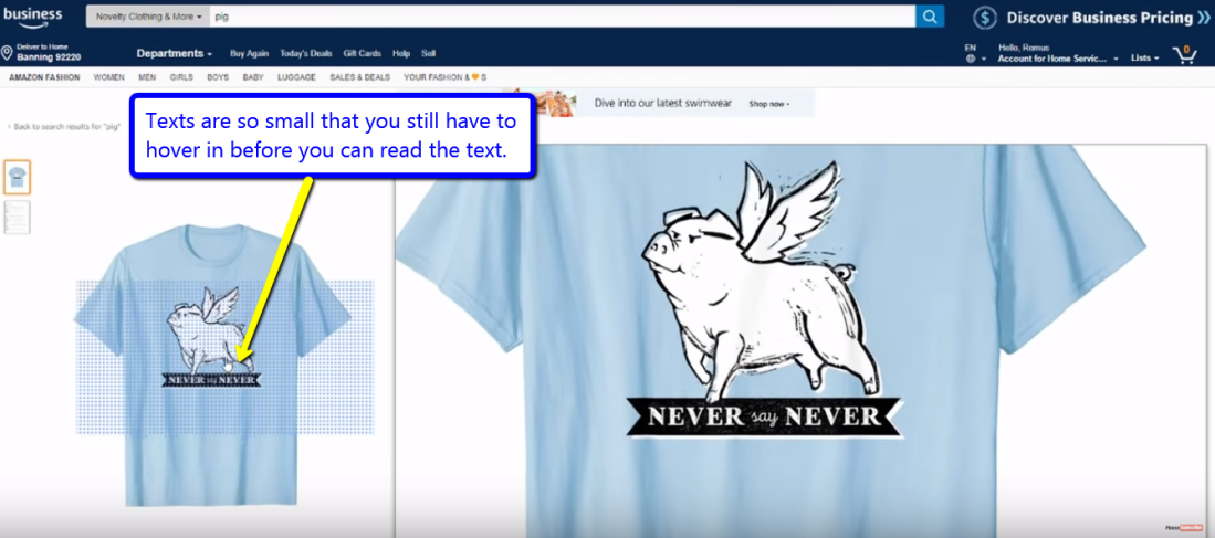
You want the text to be big and bold. You want the customer to be able to see what the text says from the thumbnail. If they can’t see that, it’s not good. I can’t stress this enough, you want to be able to see the text, and you want to be able to see the actual illustration from the thumbnail like without even clicking on it. It converts better like when the customer scrolling on their phone and they see the actual design just on the thumbnail from their phone, and they’re going to stop. But if they can’t see it, most likely they won’t even click on it. So it seems like it converts better believe it or not. If you look at the top-selling designs of top selling shirts, you’ll be able to see that their design is crazy looking. I’m not a graphic designer. I suck at designing, but I’ve been studying this whole month trying to understand the design and figure out how I can improve and make my design the best in every single niche. That’s what I’ve been focusing on lately. It seems to be working for me very well. Don’t get me wrong I have previously in the past uploaded shirts and they look horrible but I perfected through this, and I got better at it. As I said, big and bold is very important when it comes to designing. With the illustrations you want them to pop. You want to turn up the contrast to make it pop. You want the customer to stop when they’re scrolling on their phone, that’s very important.
Leaving less space on a design it is huge too. It helps the customer buy it just by going less space. If you guys can master this and get this down, I guarantee your conversion rate will be a lot higher. You need to trust me, work on this, pay attention to this and try to perfect this. It took me a while to understand this and I’m still trying to understand it, but I got a better understanding of it now. I’m growing and learning since I don’t know designing part of shirts before. I outsource a lot of this so I have my team working on this and I’m showing them precisely what I mean. So remember, illustration needs to fits in there perfectly. It will look cleaner and more professional.

If you guys have any inputs on this or if you guys are doing this right now, and it’s working for you leave a comment down below. I want to see how it’s working for you. If you guys are new, test this out and see how it works for you. I’m telling you to try this out, and this will increase your sales for sure.

I never thiought about this but you are right. The bigger, the better selling…
LikeLike
I really never thought about it until like 3 months ago. Look at the top designs and look how big the designs are.
LikeLike